Graphing Stories and Vine*: A Match Made in Heaven

*Except we won’t be using Vine.  The prevalence of explicit adult material on Vine and the lack of privacy controls have led me to look for alternatives, even though I love the simplicity of Vine.  We’re using Viddy, which, although not perfect, does a better job with privacy.

Here’s the beauty of the age we live in.  We can have students record and edit video in our classrooms with the device in our pocket.  This can be done in a matter of minutes!  There’s no need to have bulky video cameras, transfer onto a computer, deal with Windows Movie Maker or iMovie, struggle with what file types to save as, etc. etc.  Simply an app that lets you record with a little control over some editing techniques.

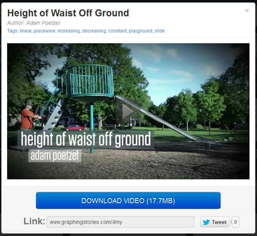
In short: I had students create their own Graphing Stories using iPads (well, iTouches to be exact) and the app Viddy.  Yet another shout-out to Dan Meyer’s Graphing Stories.  I played several of the Graphing Stories in class and now am heading up the taxonomy to have students actually create their own.  Here’s one of my examples from the students:

Although Vine is much simpler to use, it didn’t take much of me playing around with it before realizing it would be too risky in the classroom (as an aside: this is very disappointing.  My quick research found articles that alluded to Vine’s pornography problem dating back to January.  What a waste of what could be an amazing tool.  [2014 UPDATE:  Vine has gotten MUCH better in this regard.  I use it in class now!  But I don’t ask students to obtain the app – either I use it, or they are allowed to use it as a means to record video if that’s an app they already have.]  Viddy gets the job done.  We had three iTouches available to us and the kids were busy enough with recording that they didn’t get into the notion that they were using a social video app.  When you add in making the account private, Viddy almost turns into a video editing app without the pitfalls of public, social sharing.

The ease in which this allows students to create is AMAZING.  We get rid of all stuff we used to have to deal with, as described above, and suddenly the time, focus and energy is on the mathematics.  Example:

Some of the students wanted to record a group member riding one of those wheely scooters down a ramp.  They wanted to graph the person’s height off the ground.  But wait!  What would that graph look like?  Of course, it would be constant if they are referring to height off the floor, but decreasing if they are talking elevation.  That conversation happened in my class.  That is deep mathematical thought in an Algebra I classroom.

This is some exciting stuff.

Below is the project handout.  Each group was required to story-board their videos before they started shooting.  This actually helped with the notion of step functions greatly, in addition to streamlining the logistics of shooting video.  To sum it up: It was an amazing project and easily the best thing I’ve pulled off this year.  I hope it sparks some ideas out there in the MathTwitterBlogoSphere.

GraphingStories.com: Two Book Sections in 40 Minutes

Obligatory apology for rarity in posting goes here.  The end of the soccer season finally allowed me to breath… for a day.  Basketball workouts started almost immediately and I am still juggling 4 preps.  The juggling has eased up a bit – my 8th grade computers class is a quarter-long class that has started the second rotation.  That’s lightened my prep load, though just a bit.

For our standard “Algebra II” class, we use Discovering Advanced Algebra by Murdoch, Kamischke and Kamischke.  I love this book.  After a year of getting used to it and finding all the subtleties in the way the material is presented, I feel like I’m making almost all of those little connections.

The fourth chapter is on functions, transformations and the basic families of functions.  The first section of the chapter is basically this:

4.1 Interpreting Graphs
– Graphing a story
– Relationship between an independent and dependent variable
– Identifying features of graphs by describing the above relationship

Instead of writing a bunch of vocab words on the board and doing “math book” problems (after 8 seconds, how high is the balloon?), I simply showed about 5 graphing stories:

Just a picture... Click to head over to the amazing GraphingStories.com

Just a picture… Click to head over to the amazing GraphingStories.com

That was it.  That was the entire section.  I then spent 20 minutes discussing function notation and 5 minutes doing if “f(x) = 2x-4, then f(3) = ?” skill practice.

Bam.  We delved deep into the major concept of a function and truly examined the relationship between an independent and dependent variable all in one class period.

Two closing thoughts:

1.  This is one of the amazing results of Dan Meyer’s decision to take the “Graph a Story” textbook problem and put it on video.  (Though the overlaying of the graph on the video is crucial as well).

2. What other concepts do textbooks take days to develop using the “old fashioned” ways that could be examined deeper and quicker through other media?

The Most Beautiful Math I Have Ever Seen

famfun_1

Click to bigify

There’s something that is just amazing about this graph.  I love it.  It’s perfectly, slightly asymmetrical.  It is deep and detailed and simply beautiful.  And my student made it which makes even more awesome.

For those of you unaware, this is a product of Sam Shah’s Families of Curves project that I shamelessly stole for my algebra II students.  This piece was created with the function:

famfun_1aThe parameter, k, varied on the interval [-7, 7] with steps of 0.25.  The window dimensions are approximately [-3.5, 3.5] in the x direction and [-120, 120] in the y direction.

I’m printing this out as a poster to hang in my room and will be giving the artist a print of their own.  I can’t wait to do this project again next year to add to what will become quite the mathematical art collection!

Tomorrow I’ll post a few of the other amazing pieces my students came up with!

Three Acts: Basketbola Preview

Previously: Basketbola

This is probably the biggest lesson/activity I’ve put together this year. Thanks to today’s snow/ice day, what was going to be spread out over 3 days will now have to be done in two. I think it’ll be doable.

First, I’ve made it a contest. There are nine total videos of people shooting a basketball. Students will watch Act 1 for each shooter and make their prediction. Does it go in, or not? Correct predictions are worth 3 points. During Act Two they’ll have the chance to change their prediction, however it will cost them 1 point.  If they are wrong, they receive no points.

screenshot1

Act One

I’ll go through showing the nine Act Ones, as seen below. Students will make their guess. Very low entry bar. Anyone can make a guess.

Act Two

Then we’ll go into Geometer’s Sketchpad and start modeling parabolas. Here is where the competition gets interesting. Once students model their equation, they may decide their original guess was off. That’s fine, but it’ll cost them a point if they want to change. That should provide a little incentive to be as precise as possible in their modeling.

screenshot2This screenshot is in Geogebra, but my students will be working with Sketchpad, which should allow things to be a little more intuitive. I’ll set them up with a standard parabola in vertex form: y = -0.5(x – 2)^2 + 2.  That should be plenty to get them going and graphing.

As they progress through the shooters, they get more difficult. One picture will have a random three balls in the picture. One picture has three balls very close to each other, right after they leave the shooter’s hand. One shooter hits a bank shot which should really throw people off.  I’ll have them record their equations and record whether or not they want to keep their prediction, just to keep them honest.

screenshot3

Act Three

The next day we’ll come back and reveal the results.

It’ll be interesting and fun to see how much they get into it, especially when the bank shot throws the entire class off.  We’ll take a few minutes to discuss the investigation questions:

  1. Why is the value of a negative? What happens if it is positive?
  2. Describe what happened when you changed a. What happened when you made it smaller? Bigger?
  3. Describe how h and k changed. What does the point (h, k) represent? What does the line x = h represent?

As for the contest? Whoever wins gets to add their video to the library for next year.

Sequels

There’s so many other things to do with this! I could use any other form of a quadratic as the focus of the lesson (or all of them).  The sequel I like the best is this:

screenshot4In fact, this is what I hope we get to if the students are able to model the first nine shots quick enough. Had I still had 3 days instead of two, I’m sure we could have. This is a pretty obvious way to show, graphically, that having only two points is not sufficient to graph a quadratic function.

You could also talk about other curves instead of parabolas, too. I’ll be very interested to see what other questions come up in class.

UPDATE

Check out the reaction post.  In short, my students loved it: